The Beginning: 1930s - Early 1950s
As early as 1909, records were packaged in thin brown acid paper sleeves that made it easy for records to be damged in transit or storage. In 1938 a man named Alex Steinweiss was hired as the art director for Columbia records, and he convinced executives to let him add some art to the packaging.
Early Record Sleeves

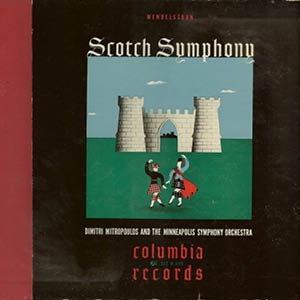

Pop music was not widely distributed in LP form, so Steinweiss was often tasked with designing art for ballet and symphony music.
After WWII, Steinweiss and his brother-in-law were tasked with creating a packaging that would both protect the record while displaying art. They would create what became the industry standard for the next three decades, and is still used today when artists decide to get vinyl editions pressed of their music.
Jazz Renaissance: Late 1950s - Early 1960s
While the standard for packaging records had been established in the early 1950s, many record labels featuring jazz musicians began to employ masterful design work that would not only set the tone for the music they packaged, but set the tone for nuanced graphic design on music packaging for years to come.
Color Channel Overlays
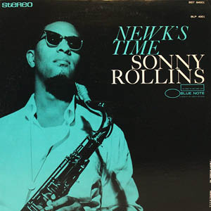

Capitalizing on the incredible photos taken during recording sessions, designers used vibrant monochromatic overlays and subtle typography to really convey the mood of Jazz and the Blues that these musicans made.
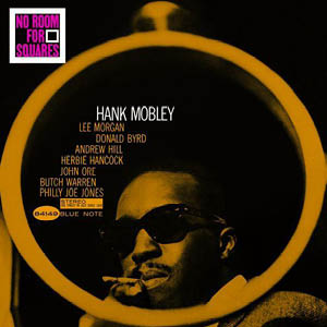
Illustrative Typography


Designers colaborated with photographers and musicians to take photos and album titles to make the typography play into the designs in subtle yet clever ways.
Abstract Illustration
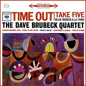
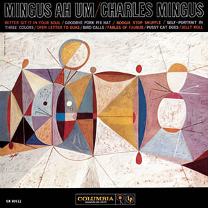
Some album designers opted to illustrate their own covers, employing avante-garde abstract geometric shapes to symbolize the movement and controlled chaos of many of the great bebop Jazz albums.
Rock & Roll: Late 1960s - 1990s
While the standard for packaging had already been established in the early 1950s, musicians and designers began to employ some very creative elements within their album art packages. Designers began to push the LP beyond the beautiful two dimensional covers from the jazz era, and employ interactive and multidimensional elements to the record sleeves to usher in a more all-encompassing and immersive experience for listeners.
Led Zeppelin III, 1970. Designed by Richard Drew, this innovative gatefold has holes on the front that peep through to a circular collage that spins, allowing the listener to change the cover.
Left: Some Girls, The Rolling Stones, 1978. Designed by Peter Corriston, alternate sleeves can be put in the jacket to display different face.Right: The Velvet Underground and Nico, 1967. Designed by Andy Warhol, the banana can be peeled off to reveal a red banana.
With advent of cassette tapes, and later CDs, much of the immersive and multidimensional elements of album art packaging was abandoned because of the small and ergonomic nature of listening devices and technology. With that being said, designers were still creating beautiful album covers in the 1980s and 1990s, despite the small two dimensional packaging, and even experimented with various CD booklet designs and foldouts. With the purely digital age of music consumption on the horizon, more album art innovations were still to come.
The Streaming Age
The modern era of music listening has ushered in many technological advances that allow people to listen at home or on the go, quicker, easier, and more immersively for a more ergonomic experience.
The chart below should give an idea as to how five major platforms are dominating the way in which people listen to music.
Data collected from metrics published by each company.
Design Trends
While the variety in album art design in the 21st century is due to greater accessibility to create and share music, there are still some significant common design trends used throughout the last two decades.
Glitch Art


Album art in the modern streaming era has borrowed elements of 1980s cyberpunk and 1960s psychedelic style with a modern digital spin to create a glitched effect on images and graphics.
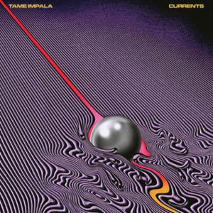
Pyschedelic Portraiture


Simple monochrome backgrounds with jarring, surrealist images of the artists have adorned many album covers in the modern streaming era.
Baby Pictures
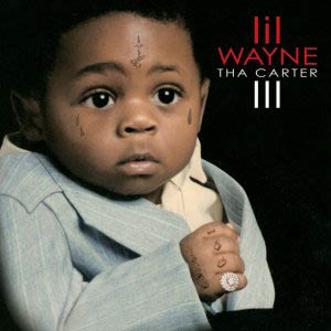


Many artists have opted to plaster their album covers with images or illustrations of them as children, sometimes superimposing their present tattoos on their younger selves.
Spotify UI Case Study
Many streaming platforms are using mobile formats to find ways to make album art take on a whole new meaning. Using the original cover art as well as gifs and videos, listening to music has never been more dynamic and immersive.
Listeners have the ability to toggle between the original cover art and a dynamic looping video. On some songs, listeners have the option to swipe up and view the lyrics in real time, accompanied by an analysis.